Day Trip
I’m teaching a class on painting watercolors from photographs. One of my first rules is I must approve the students’ chosen images before they begin their paintings. I like them to paint from their own photographic images, be they from a digital SLR, a simple point-and-shoot camera, an iPhone or an iPad. Photographic prints and film cameras are allowed though the beauty of the digital world is the ability to see results instantly – plus – photo manipulation and the ability to blow things up digitally are great tools for artists today. The iPad & iPhone, because of their ease of use and optimal portability are ideal choices for taking good images.
Painters are one step ahead of most photography amateurs because of our innate sense of design, composition and color. I have always used a camera as a tool in my work and have become comfortable over the years with the technical aspects of photography though I certainly don’t consider myself a professional photographer. I encourage my students to read up as much as they can and seek out photographic workshops with professional photographers to increase their photographic knowledge.
I have a list of things that help one take or choose a good image and right up front I frown upon photos of grandchildren, pets, or family vacation photos. I tell my students to have empathy with the viewer – make things visually interesting and not so predictable for them. I ask them to ask themselves why a particular image is appealing. Why would it make a good painting? Some subjects make great photographs but not so great paintings and vice versa. I ask students to keep an open mind and be honest with themselves.
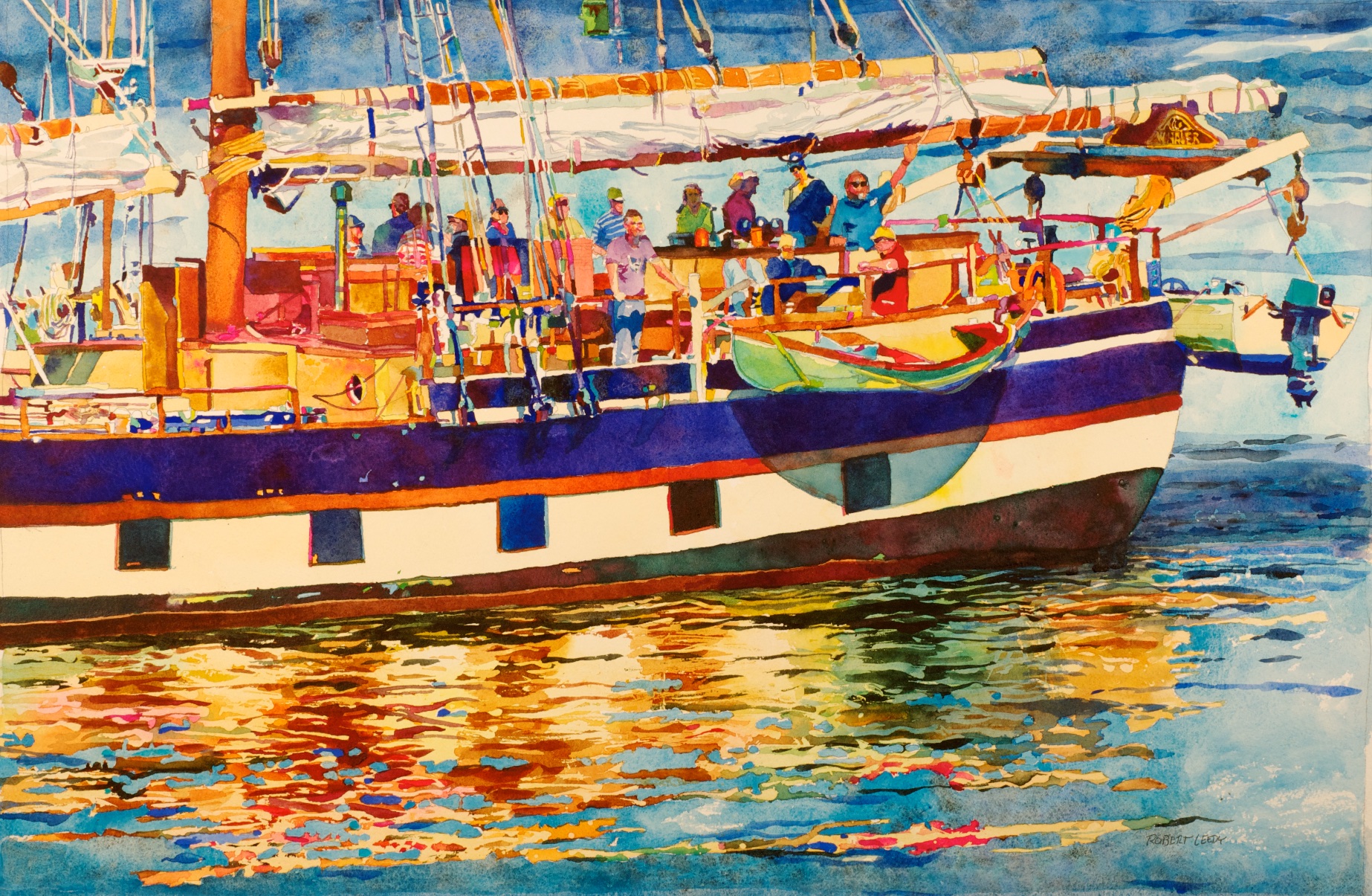
One of my students submitted several images including the one below:
![[Photo 5]](https://robertleedy.com/wp-content/uploads/2015/01/wp-mystic-whaler.jpg)
Student Photo
One of the easiest fixes in the editing process of students’ photos is simply cropping or zooming in. It is amazing what a simple crop can do. I edited the image in Adobe Photoshop and found a composition I like which ended up being a tiny area in the lower right-hand corner. There were a lot of figures and “things” towards the stern of the boat which I found visually interesting. I simply made my crop and the image was entirely different from the original.
I adjusted the levels and exposure then made sure the white balance was good.
Next, I did something that makes most professional photographers cringe: I cranked the image’s color saturation to the maximum. This creates unusual (and usually unnatural) color intensity which may not be good for the final photograph but it is wonderful for the painter. Photographers will often slightly boost color saturation to liven skin tones or make a select color or object pop out; however, they rarely adjust it beyond a minimal boost and many photo purists will not do it at all. For painters, it automatically shows interesting color combinations and provides ideas for the painting. For painters, the enhanced colors may not be true to reality but the painting will still be believable – not so if it were handed to us by a photographer.
Still, the whole process of painting is an ongoing editing session. Some colors will be enhanced; others will be subdued. And as I have always lived by the idea – what you do next depends upon what you just did.
My student liked the idea and chose this project as her painting. Even though it was radically cropped, the image was still complicated. She was excited about the image and dove in enthusiastically.
I also liked the image so much, I broke one of my own rules: I used someone else’s photo! I asked her if she would mind if I used her image for MY OWN painting purposes. She thankfully gave me her blessing…
Once edited and in my own computer, I projected the image on the wall with a digital LED projector like one you might see in a corporate boardroom Power Point presentation. Many artists might seriously object to this but I fully embrace technology – and run with it! I am a skilled draftsman and I would not suggest it to anyone who is not fully comfortable with drawing on their own. It is actually tricky as you need to learn what to use and what not to use (editing again…) The great thing is that it saves time and is very helpful with complicated subject matter.
Next, I sent a high resolution image (the original photo, cropped and manipulated) to my iPad which sits in a stand next to my watercolor paper, palette, water container and brushes. With the iPad, I am able to zoom in very close to see incredible detail.
My student was well into her painting when she complained about feeling like she was working on a paint-by-number painting. She is used to painting from live subject matter – whether it is from a class still life or a trip outdoors en plein air.
“No problem,” I told her, “Don’t feel like a slave to the projected line; allow yourself to make editing choices and try to remain painterly within the confines. And don’t always feel the need to render something fully representational – take liberties to work in an abstract manner – within the confines.” As I often preach to them, don’t worry so much about the rendering – worry about making interesting marks and an overall interesting painting visually. Let your intuition navigate!
Below is my painting of the boat:
“Day Trip”, by Robert Leedy, watercolor on Arches 300 lb. Cold Press paper, 19.5″ x 28.5″. [click image to enlarge]
!["Day Trip" [DETAIL], by Robert Leedy, watercolor on Arches 300 lb. Cold Press paper. There are wonderful abstract compositions throughout this painting. I wasn't necessarily painting "things" - I was composing and designing with color. [Click to enlarge image].](https://robertleedy.com/wp-content/uploads/2015/02/day-trip-4-version-2.jpg)
“Day Trip” [DETAIL], by Robert Leedy, watercolor on Arches 300 lb. Cold Press paper. There are wonderful abstract compositions throughout this painting. I wasn’t necessarily painting “things” – I was composing and designing with color. [Click to enlarge image].
My student’s painting turned out great. She is very happy with it. My other students in the class working with different subject matter all showed amazing results. I hope to post images of their finished paintings soon.

Wednesday is our last class. A new class session will start February 25th at The Cultural Center at Ponte Vedra Beach, Florida. The class is open to Intermediate Level watercolor students and is treated as an ongoing painting session – meaning we welcome both returning students and newcomers. Classes are every Wednesday from 9:30 am – 12:00 pm until April 15th. For more information or to register for the class, go to The Cultural Center’s Adult Classes link or call Anna Birtles @ (904) 280-0614, ext. 204.
If you are interested in purchasing “Day Trip”, click here.
About this entry
You’re currently reading “Day Trip,” an entry on Robert Leedy Watercolors
- Published:
- February 15, 2015 / 5:36 pm
- Category:
- Art, Art Class, Artists, Leedy Artwork, Painters, Painting, Watercolor, Watercolor Class, Watercolour


No comments yet
Jump to comment form | comment rss [?] | trackback uri [?]