The Watercolorist’s Worst Nightmare: Correcting a Major Mistake

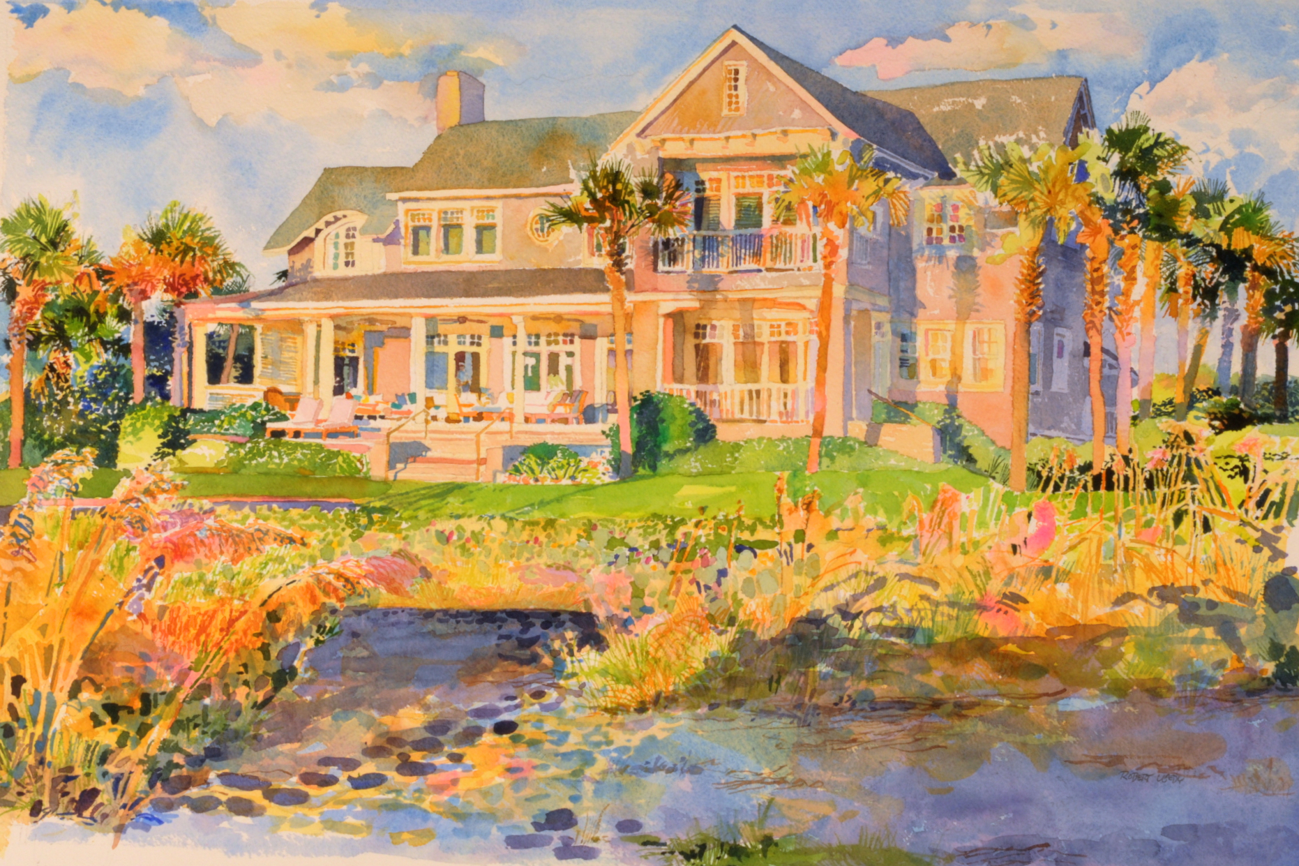
The final, corrected painting or the AFTER version. “A Place in the Sun”, by Robert Leedy, watercolor on Arches 300 lb. Cold Press paper, 17.25″ x 26.25″, Private Collection.
An oil painter simply scrapes the paint off. An acrylic painter need only paint over what she’s done.
A watercolorist cries. Then he starts a new painting.
OK, I am going to expose a bit of myself here; I will be brutally honest with you and share a recent learning experience I had. Yes, everyone makes mistakes and mine came along at the wrong time…
I was commissioned to paint a watercolor of a beach house in Ponte Vedra Beach, Florida. I drove out early one morning and spent several hours photographing the house in beautiful, early morning light. The house is an impressive structure set along sand dunes, sea oats, and wild prickly pear cacti with a wonderful view of the Atlantic Ocean. Happy with the shots, I went back to the studio and began painting, “A Place in the Sun”, a watercolor on a full sheet of Arches 300 lb. Cold Press paper.
Artistic liberties were taken – such as the removal of the next door neighbor’s house to the south. I replaced it with palm trees, palmettos and bushes. No problem. We disagreed on the wooden walkway and stairs – a public access – that intersected the foreground in the lower right of my potential composition; I argued that the play of morning light on the railing and stairs would create interesting contrasts of pinkish-orange and blue shapes that would add to the overall appeal of the painting AND help break up some of the space of the expansive foreground. The client was concerned that it would take away from the view of the house. He was footing the bill so, he won that argument.
The bones of the painting came together quickly – including the lighter, warm colors for the dunes and sea oats. I liked what I initially had and, over the course of several long painting sessions, the details and glazed washes slowly came together. The foreground was simply suggested and I initially planned to leave it that way but the space was quite large and I later painted large washes in to unify the area. It still needed something though…
My good friend, [oil painter] Paul Ladnier, stopped by my studio one day as we were headed to lunch together. I asked his opinion of the painting and what the foreground needed.
Paul studied the painting for a few moments.
“I would simply create some horizontal lines to create a sense of depth and space. Start in the upper area of the foreground with smaller lines and make them larger as they come down to the lower part of the foreground.”
I was confused: “Do you mean uninterrupted horizontal lines? Or break them up?” I didn’t really think that was appropriate for sand.
“No,” he answered, “just look at Winslow Homer’s work and how he handles water…”
“But Paul…it’s NOT water…”
“It’s NOT?”
I still remember his look of surprise and his silent stare of disbelief back at me with a dropped jaw.
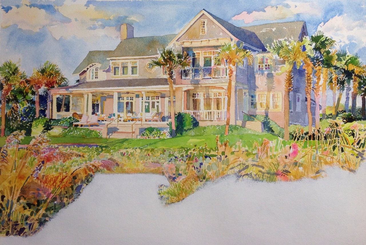
My painting in its original state – the BEFORE stage
The sand dunes started looking like a pond instead of sand and sea oats. The blue-violet shadows magically morphed into water. The beautiful Ponte Vedra oceanfront home was now situated on a South Georgia duck pond. I went back to my reference photo and sure enough – the sand was violet-blue in the early morning shade.
I had other people look at it and they loved it. I even asked them if it looked too much like water. No one seemed to think it did. I asked my framer whose opinion I respect and he thought the painting was fine and said it needed nothing more. He framed the painting and brought it back to me a few days later. It looked even better dressed up in a large, double white mat and a simple, thinly white-washed wooden frame which would match the home’s interiors perfectly. I was happy with the painting but still ran it by my toughest critics: my wife and my mother. Neither thought the foreground looked like water and they both really liked the painting.
I delivered the painting and the client seemed to be very happy with it.
My mother called the next morning and she did what mothers seem to do so well: she jabbed me with a little remark that was a bit late in its timing.
“I know you don’t want to hear this but I have been looking at that painting (I had sent her an image via email) and now that I think about it, the sand really does look like water.”
“Mom! Thanks for telling me NOW! I delivered the painting YESTERDAY – a day after you told me the painting looked fine!”
The Ponte Vedra Pond House was starting to haunt me.
When I saw the client’s name on my caller ID the following Monday morning, I already knew what the conversation was going to be about. He wanted to discuss something with me in my studio. He arrived later that morning with the painting in tow.
“Robert, I took the painting home and presented it to ‘the committee’ [other family members],” he announced. “We all liked it but they think the sand looks too much like water…can you correct it?”
I told him I could try but most likely I would need to start the painting over. He suggested we crop it horizontally between ‘the water line’ and the area where the front lawn ends.
“No, that won’t work compositionally,” I told him, “if anything, I will repaint the painting.”
He left the painting with me.
This never had happened to me. Sure, I had corrected small areas in paintings – usually by simply lifting color out with a damp brush – but never corrected large areas that took up a third of the painting such as this one. An artist friend couldn’t believe I never had encountered such a problem before: “I normally don’t make mistakes,” I joked back.
I knew of a product called ‘watercolor ground’ but had never used it. I went to a local art supply retailer and bought a product called ‘Absorbent Ground’ by the paint manufacturer, Golden. I called Golden’s technical support line which is manned by actual artists and spoke with Mike who was very well- versed with the product. He assured me the product was the best available and that I would have no problem correcting my painting. He went over the process with me in detail and referred me to several online videos available on their web site.
I also purchased two containers of Daniel Smith’s Watercolor Ground online. The fact that it was specifically named ‘watercolor ground’ was a bit more reassuring. I bought one labeled ‘Bright White’ and another labeled ‘Buff Titanium’ which was more of a beige color for those watercolor papers that were more off white.
I also called Jennie Szaltis, a local watercolorist who I knew if there was one painter who knew about watercolor mediums, she was the one. Jennie graciously met me at my studio and brought several containers of watercolor ground and we experimented on test strips of paper. Jennie claims the Daniel Smith product is good but it is a bit too gritty, so she blends it with the Golden product – and water.
I later decided to go with Golden’s Absorbent Ground (White) that I purchased originally. After Jennie left, I noticed the jar she was using was labeled Golden Gesso; it might have been Absorbent Ground in a Gesso container…I did not confirm with her. Mike, the Golden Tech, was very confident about Absorbent Ground.

The first coat of Golden’s Absorbent Ground (White) applied. The streaking and the fact that it was not covering well was a bit nerve wracking!
I began the process by lifting the blue-violet color. I used a clean, damp brush and the results were not very effective. The colors were more staining (unliftable) than I imagined they would be. I could have put my painting under a spigot in the studio sink but I decided to dry the area well and apply the ground. I thinned the ground with about 15% water and applied it with a #6 watercolor brush. The initial coat was a little thinner and did not cover the underlying paint very well – it actually streaked the paint and things were not looking good [see photo].
It was obvious I would need multiple coats. At this stage, I kept asking myself if I really wanted to stick this out. Perhaps I should just save a bit of time and begin a new painting? I persevered and applied more coats. I was careful to let them dry well in between and I was very attentive to feathering the edges to keep the layers of ground from building a visible edge.
My next worry was that the application was too white. Arches 300 lb. Cold Press – the watercolor paper I was using – is fairly off white and I could easily see the color difference. The shipment from Daniel Smith had not arrived yet; maybe my best choice would have been to mix a tiny bit of Watercolor Ground (Buff Titanium) with the Golden Absorbent Ground (White). Instead, I added a bit of Naples Yellow watercolor pigment to the Golden Absorbent Ground (White) and got a bit of an off white color.
The subsequent layers became more opaque and thankfully, the underlying watercolors were no longer showing through. The covered area was extremely white and I was concerned about the effect of two separate areas that did not seem to relate. Would I be able to “seamlessly” connect these unrelated areas back into a unified watercolor painting?
I laughed when I realized the area not longer looked like a pond – it was now a golf course sand trap!
The ground became more opaque white as I added coats. No longer did I have a painting of a house on a pond – now I was dealing with a house on a sand trap!
Now I was ready to paint. I believe it is very important to allow the ground to thoroughly dry. I gave it 24 hours before I laid the first washes of watercolor down.
I was also concerned over the way the paint would lay down: I had a feeling – because of the surface of the ground – that my end result would be closer to the texture of Hot Press paper (smoother) instead of Cold Press (the paper I was using.) Paint on a Hot Press surface is actually visually different. I overcame this potential problem by keeping the texture of the ground fairly rough. If you are not careful, the multiple coats get smoother and smoother as you progress; I frequently stippled my brush to maintain texture. On the other hand, it is also important not to get too much texture going on.
I was very happy with the initial washes of paint. It seemed a little bit similar to Hot Press paper but this lessened as I added subsequent washes of color. The important thing was to carefully cover up “the seam”. I redesigned the compositional elements a bit. I needed to get rid of the straight line created by the horizontal edge of blue pigment [see the BEFORE painting]; My intention was to create an area of sawgrass and create a dark to unify the left and right sides.

Watercolor is applied to the ground.
In addition to the green area applied for the grass, I did mingling mixes of Brown Madder, Cerulean Blue, Imperial Purple and Opera. With these colors, I created the patterns in the sand. You can imagine I was paranoid about using the color blue and shied completely from early morning shadows. I also extended another sea oat stem to help “the seam”.
I never was happy with the green and the darks that I began placing in the painting. I chose to eliminate them and did so with another multiple coating of Absorbent Ground diluted with water.

The darker green area and the neighboring darks proved to be a mistake which I later covered with more layers of Golden Absorbent Ground (White).
Once the second corrected area was dry, I added my sand colors and a small bit of vegetation to “seam” the two edges. I signed the painting and my framer reframed it in the original frame. It looked great! I delivered the painting to the client and everyone was happy with the new version.
This was quite a learning experience for me and worth the unintended extra hours I put into it. I now know how to correct a major section of a painting (or smaller if needed) though I do not intend to use this procedure as a crutch. Had it not been a commission, I imagine I would have tossed it to the side and started a new piece. I hope I don’t need to use this process again but if I do,
I have the experience under my belt.
The final, corrected painting or the AFTER version. “A Place in the Sun”, by Robert Leedy, watercolor on Arches 300 lb. Cold Press paper, 17.25″ x 26.25″, Private Collection.
About this entry
You’re currently reading “The Watercolorist’s Worst Nightmare: Correcting a Major Mistake,” an entry on Robert Leedy Watercolors
- Published:
- March 28, 2014 / 9:29 pm
- Category:
- Art, Artists, Leedy Artwork, Painters, Painting, Watercolor, Watercolour


4 Comments
Jump to comment form | comment rss [?] | trackback uri [?]