Painting Pablo
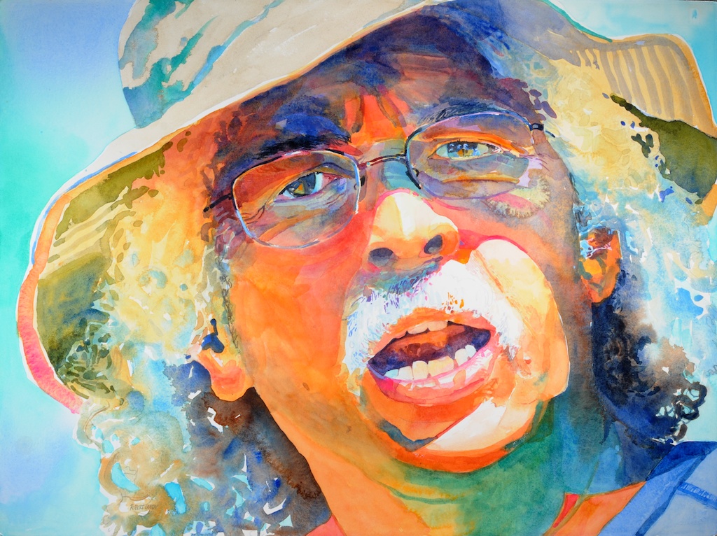
“Pablo”, by Robert Leedy, watercolor on Arches 300 lb. Hot Press paper, 22.75″ x 30″, Collection of Pablo Rivera, Neptune Beach, Florida
I am experimenting with a new manner of framing which will enable me to present watercolors without matting and the use of glass as is the case with traditional presentation of watercolor paintings. Hopefully, this method will not only allow me to paint on a larger scale beyond the size limitations mat board imposes but it will also eliminate distracting light reflections as a result of works under glass – even those that expensive museum glass creates. The process involves varnished watercolor paper mounted onto Dibond, an aluminum composite material.
I chose to paint a figure of some sort onto a full sheet size watercolor paper – not as large as I wish to eventually work but a good starting point for my experimentations with varnish on watercolor paper. As I browsed through my photographic images, I came across an image of my friend and fellow artist, Pablo Rivera, that I took a while back when we were plein air painting together one afternoon. Pablo has very distinctive features and I figured he would easily be recognizable if I selected him as my subject. I also think that, like doing good imitations of people, painting their portraits requires a good backlog of subject observation; I’ve spent enough time around Pablo to make that requirement.
I began my painting on a full sheet of Arches 140 lb. Hot Press paper. Hot Press is a smoother watercolor paper. Colors appear a little more intense than they do on Cold Press paper. Paint does not absorb as much and tends to sit on the surface a bit more which gives a sort of blotchy effect.
The palette I used consisted of the following colors:
- Naples Yellow
- Aureolin
- Cadmium Yellow
- Yellow Ochre
- Cadmium Orange
- Quinacridone Gold
- Light Red
- Cadmium Red Deep
- Carmine
- Opera
- Lilac
- Permanent Violet
- French Ultramarine
- Peacock Blue
- Cobalt Blue
- Cerulean Blue
- Verditer Blue
- Cobalt Green
- Winsor Green (BS)
- Viridian
- Olive Green
- Burnt Umber
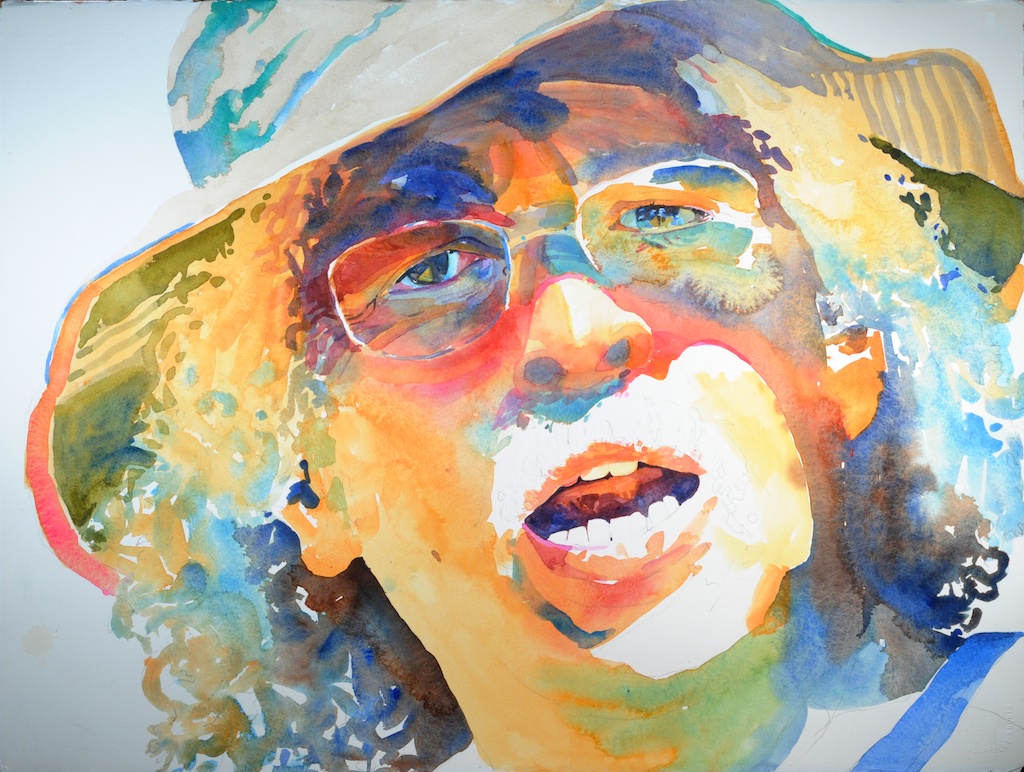
Step 1 of “Pablo” (click on image to enlarge)
Step 1
After completing my drawing, I did a very loose painting of the face only. I used a #24 round (a big brush) which kept me loose and fast. I was careful to preserve my highlight areas and I avoided the eyes. I began in the center of the face and quickly moved around the entire face adding color and allowing it to mingle which meant I needed to not allow the paint to dry. At this point I am not fussy about drifting color or running outside of the lines. It is a very loose application. Next, I worked warm-to-cool colors wet-in-wet to create the hair. After that, I loosely painted in the areas of Pablo’s hat.
Though this is a fast step (I think I spent no more than 30 minutes), it represents the majority of the painting for this piece.
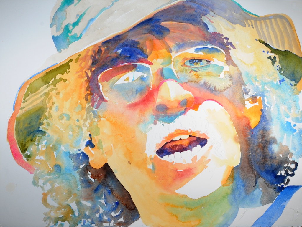
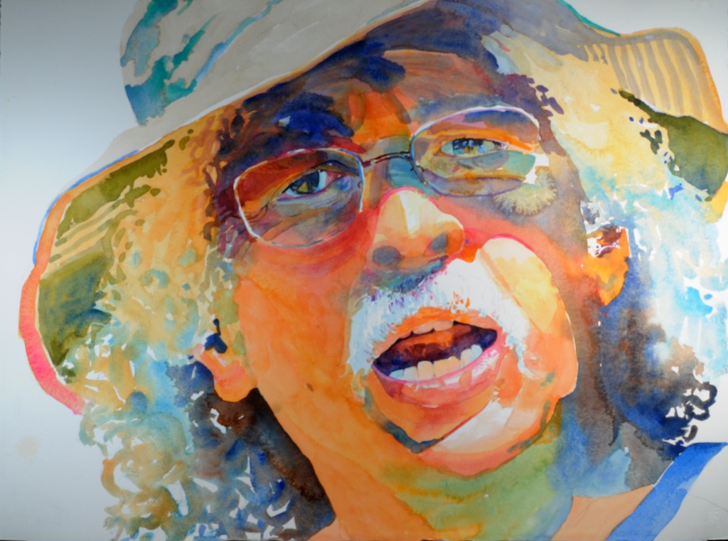
Step 2 of “Pablo” (click on image to enlarge)
Step 2
I tackled the eyes first. The logic being if you screw the eyes up, you lose the entire painting. And I might add it is normally a good idea to paint both eyes simultaneously. That way you can maintain somewhat of a match – though nature rarely exhibits perfect symmetry in human faces – or bodies for that matter…
I also worked on the mouth. In the drawing, I was worried that Pablo looked angry. This was a problem. In real life, Pablo is the last person on earth to show anger. He is such a nice, positive person and the last thing I wanted to do was paint a portrait of him with a negative air about him. He is actually in the middle of speaking and I was lucky to transfer that into the painting. I have no recollection of what he was saying but as far as Pablo expressions go, it looks like it was a pretty important fact…
Here is where technology creeps in: I often use an iPad as a camera AND viewfinder as it is a great way to frame subjects. But the bonus is the capability of zooming in to look at detail once the photo is taken. Below is a detail of the original photo I took of Pablo. The zoom factor gives me the ability to look closely at detail.
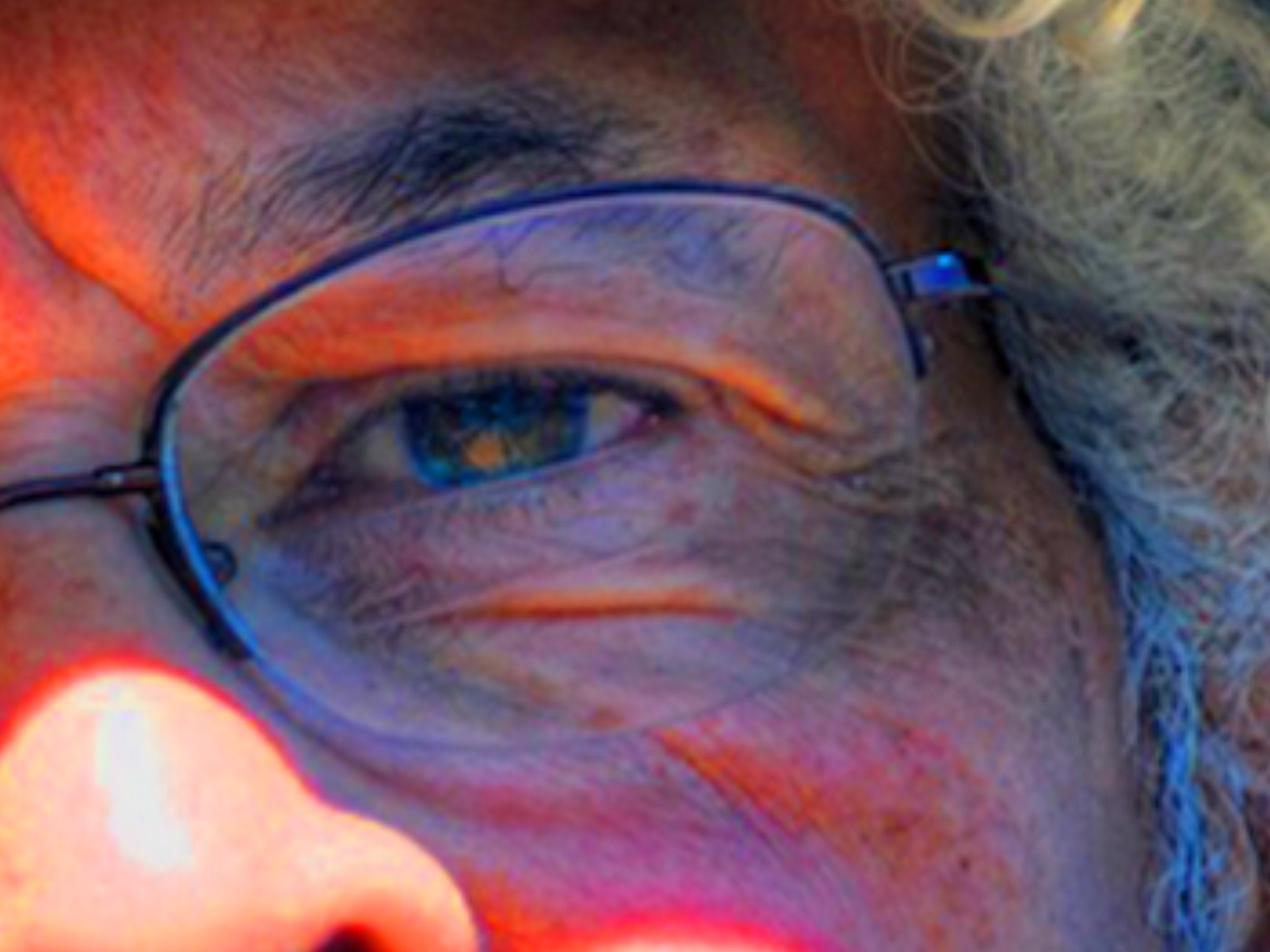
detail of Pablo’s eye from my iPad photo.
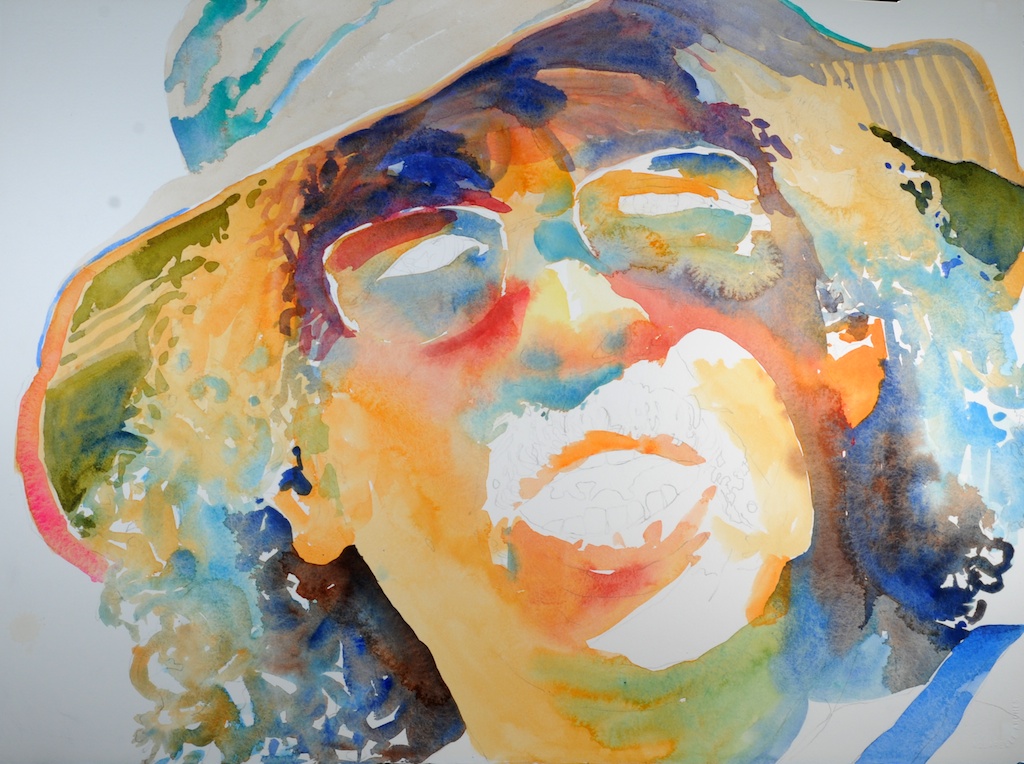
Step 3 of “Pablo” (click on image to enlarge)
Step 3
Next, I tackled Pablo’s right eye. Using the iPad camera zoom, I carefully observed the shapes and colors I observed in his eye. At this stage I also dropped in the blue shadow on his chin.
Step 4 of “Pablo” (click on image to enlarge)
Step 4
Here I am basically glazing washes to enrich color. I work a bit on defining the mustache and further detailing the eyes.
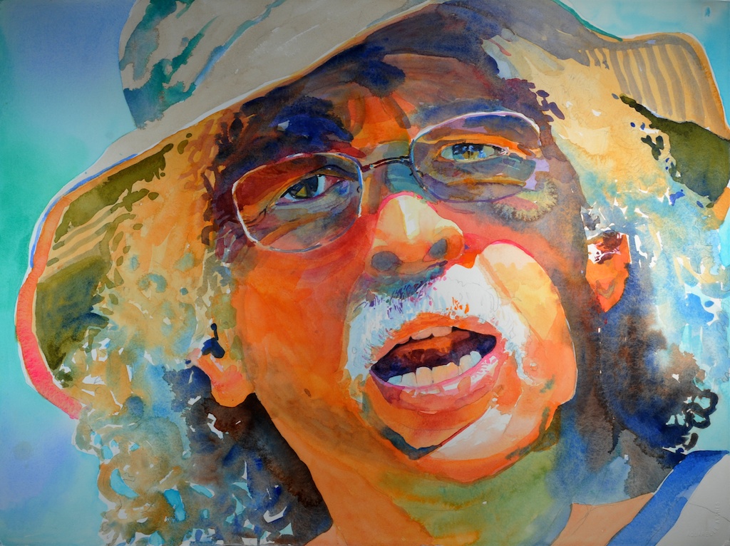
Step 5 of “Pablo” (click on image to enlarge)
Step 5
I now added the background. Since the subject is predominantly warm, I wanted a cool background. I did a very wet-in-wet application of cool greens and blues. More detail is added here and there throughout the painting.
Step 6 of “Pablo” (click on image to enlarge)
Step 6
Now I am deepening values and darkening areas. The most obvious is the green shadow under his chin.

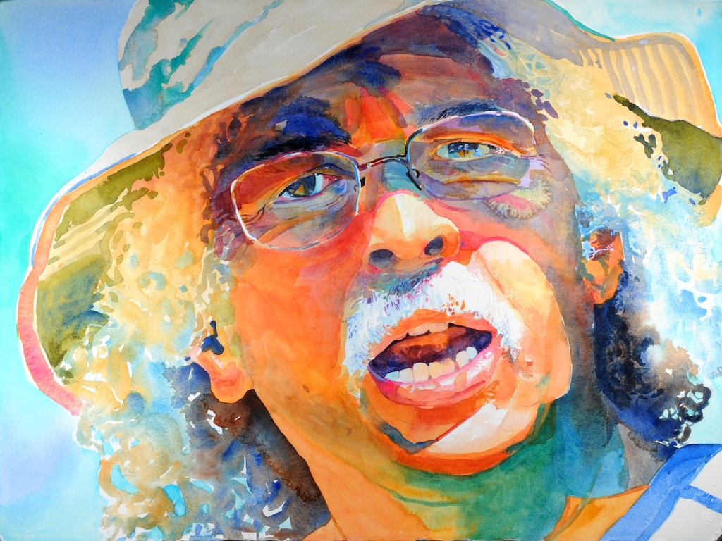
Step 7 of “Pablo” (click on image to enlarge)
Step 7
As I reach the final parts of the painting, I argue back and forth with myself over how much detail I continue with. Parts of the painting are quite detailed while other areas are not. This is purposely done so as to maintain interest – no one gets excited over information that is completely spelled out. I think I am finished.
About this entry
You’re currently reading “Painting Pablo,” an entry on Robert Leedy Watercolors
- Published:
- June 25, 2013 / 11:07 pm
- Category:
- Art, Artists, Figurative Works, Leedy Artwork, Painters, Painting, Puerto Rico, Watercolor, Watercolour
- Tags:
- Pablo Rivera, portrait


4 Comments
Jump to comment form | comment rss [?] | trackback uri [?]